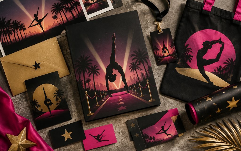
Gymtastics Hollywood Classic was a direct-client branding and graphic design engagement for Kordspace in the entertainment and events sector. The project centered on giving the event a recognizable visual identity and a coherent presentation. Its creative scope brought together brand expression, graphic composition, and the practical communication needs of event promotion. This work represents Kordspace's creative foundations: shaping how an experience is presented before introducing the complexity of software or digital product development.
The challenge
The central design challenge was to make the event identity distinctive while keeping promotional information clear and accessible. An expressive event brand needs enough visual energy to attract attention without overwhelming names, headings, and supporting details. The design direction also needed to remain coherent across different layouts rather than depend on a single composition.
Our approach
The approach centered on treating branding and graphic design as one coordinated discipline. The event name provided the anchor for a visual hierarchy supported by typography, color, and graphic styling. Composition focused on balancing recognizable brand elements with space for practical event messaging. Reusable layout principles offered a way to extend the creative direction across promotional applications without losing consistency. The scope remained focused on visual communication rather than application engineering or platform implementation.
The outcome
The engagement contributed a unified visual direction for Gymtastics Hollywood Classic. Its value lay in connecting the event's identity with the graphic presentation of its promotional materials. The project stands as a creative-services engagement, with its contribution centered on brand coherence and communication rather than measured commercial or technical performance.
Technical highlights
- Information hierarchy balancing event identity and supporting copy
- Coordinated typography, color, and graphic styling
- Reusable composition principles for promotional layouts
- Design-led scope without an asserted software stack
Place in the journey
2015–2017 Web + CommerceThis project fits Kordspace's Creative Foundations era by type, reflecting the visual communication work that complements its broader app-studio capabilities. It illustrates the role of brand clarity and design consistency within that wider practice.