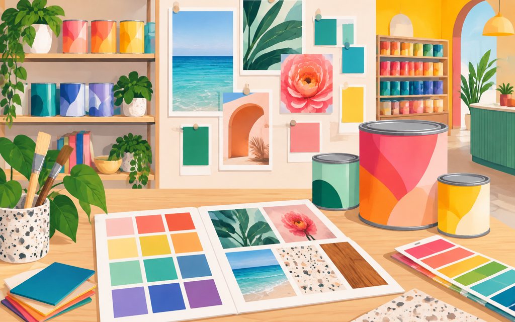
Pur Color & Color Blend Creations was a direct-client creative project centered on mood boards and guides for a commerce, retail, and consumer-products context. The work focused on organizing visual inspiration into a coherent direction for brand presentation. Its scope was creative rather than software-led, emphasizing color relationships, imagery, and supporting design guidance. The project represents Kordspace’s foundational design work: translating visual ideas into reference materials that can inform later execution.
The challenge
Mood boards need to communicate a recognizable direction without becoming disconnected collections of attractive references. For this type of consumer-facing work, the challenge is to make color and imagery feel cohesive while retaining room for creative exploration. Supporting guides must also help readers understand how to interpret that direction without implying that every design decision is finalized.
Our approach
The project paired mood boards with guides, connecting visual exploration to explanatory material. A fitting approach to that scope is to group references around complementary color relationships, image treatments, and overall tone. The boards provide the visual anchor, while the guides explain the principles behind the selections. Together, these materials support creative discussion and give subsequent design work a shared starting point rather than a rigid production specification.
The outcome
The project’s recorded output was a set of mood boards and guides for Pur Color & Color Blend Creations. These materials provided a creative reference point for discussing visual direction and brand presentation. The outcome is best understood as design groundwork, not a launched commerce product or a measured business-performance result.
Technical highlights
- Mood-board and guide pairing that connects inspiration with explanation
- Color-led organization of visual references
- Reference-based design documentation rather than application development
Place in the journey
2017–2019 Software + CloudThis project fits Kordspace’s Creative Foundations era by project type rather than a confirmed production year. It reflects the visual communication and design-documentation skills that complement the studio’s broader product engineering practice.